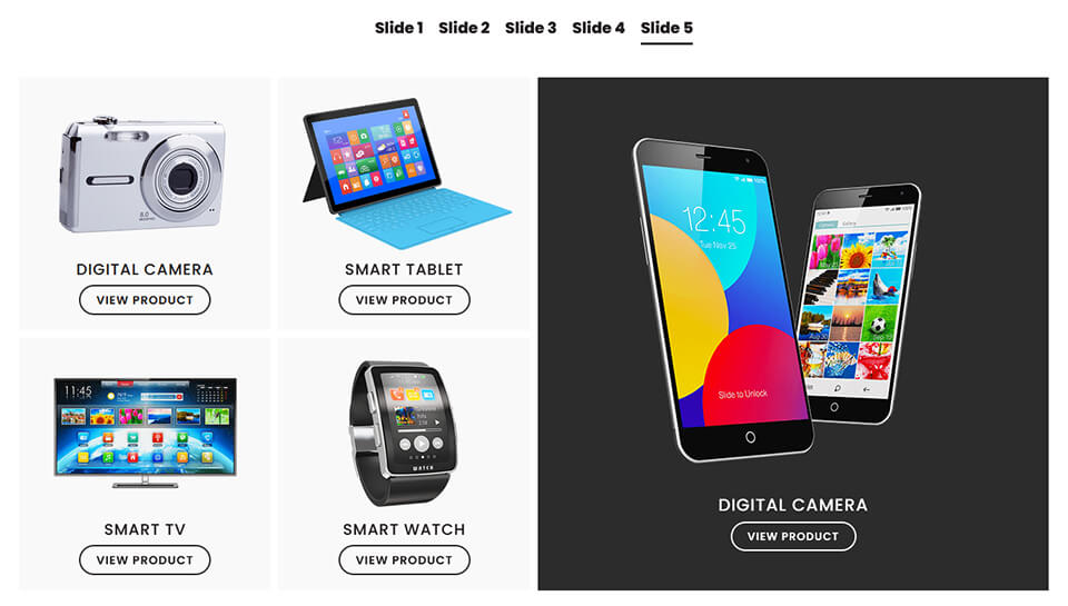
If you’d like a horizontal content slider that allows you to define the number of columns per slide, use any module, and write the navigation titles yourself, this freebie is for you.
I’ve created a free template that you can import into a page or Theme Builder layout and style to your needs. There are two sections used as content containers, one for the slide navigation, and one for the content. Each slide is a Divi row, so you can adjust column structure per slide and add any modules you like. It’s also height adaptive, and touch scroll enabled.
In the demo, I’ve used blurb modules to showcase products, which you can adjust or replace with other modules of your choice, just keep the slides and navigation within their respective sections.
How to use this template.
Unzip the download file and import the JSON layout into a page or Theme Builder layout.
I designed this template with demo content, but you can replace the blurb modules, change the column structure for each slide, extend the width of the rows so they span the whole screen, and add more if you need. Here are some thing’s you might like to change.
- Row width & padding – This had been modified in all rows within the slides section: Row settings > Design > Sizing & Spacing.
- Background colours – This is set in each of the modules: Module settings > Content > Background.
- Add more slides – Add another row to the slides section and then add your modules. Add another module to the navigation section and title your slide. Make sure the slides and their corresponding navigation modules are in the same order.
- If you decide to use the included blurb modules, the background colour for the View Product button on hover is set in the CSS code module.
- If you have more than 10 slides, edit the corresponding value in the JS code module (where you need to change is commented).
- Within the visual builder, both the navigation and the slide content will appear vertically stacked. You need to view the live page in a browser for the slider to function.
- This template uses slick.js. You can find out more and add/adjust functionality but viewing the docs here.
Everything else is easily adjusted in the various rows, columns & module settings.
Enjoy!
Michelle x
Pro Pass Membership
Want access to all current and future child themes, kits, and our B&B Blocks library for Kadence for one low annual price?