Getting started
Note: After an update to the plugin which manages licencing for B&B Blocks, licence managment has moved and can no longer be accessed from within your order. There is now a dedicated link called ‘manage licences’ in your my account dashboard.
General information
Colours and fonts
Don’t be fooled by the colours and fonts you see in our demos and inside the B&B Blocks cloud library. All our blocks adopt your own colours and fonts on import and can be modified using the native Kadence settings.
Image placeholders
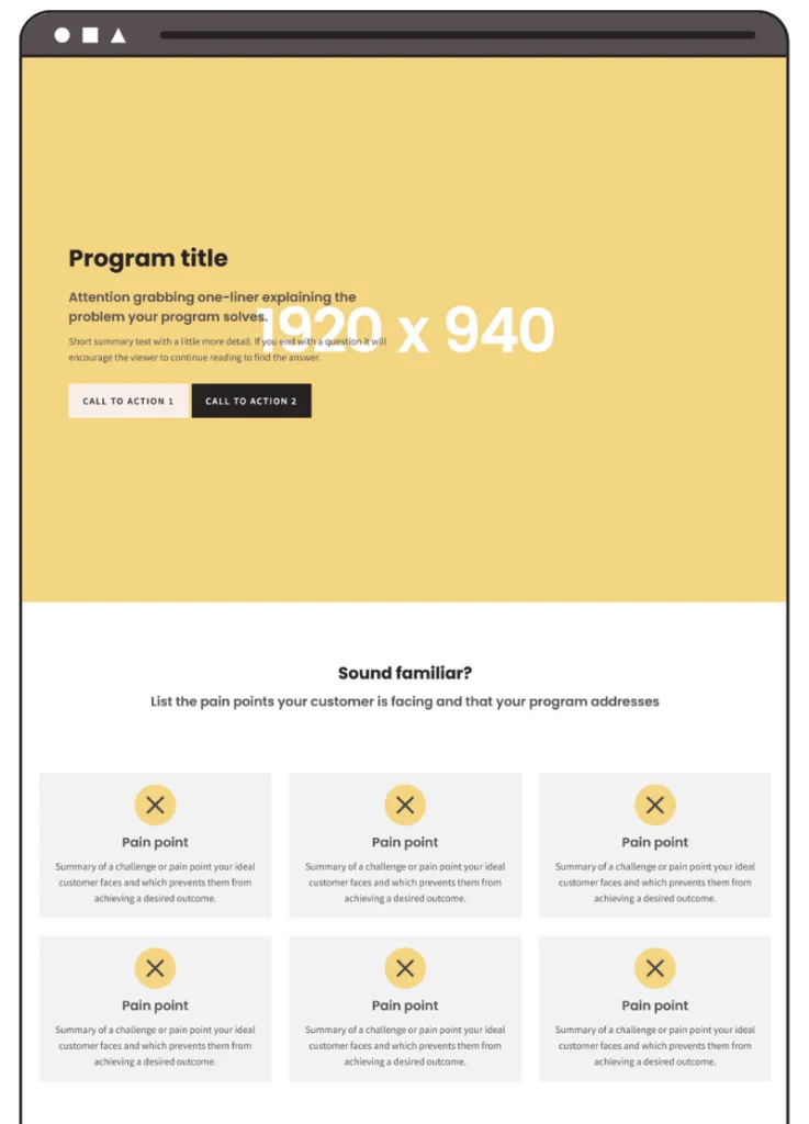
We have left the stock images in the screenshots of our blocks so you can see how the block should look.
When you import a block, any images will be replaced with a placeholder including recommended sizing info, so it’s easy for you to add your own content.
Block categories
We try to be as thorough as possible with categorisation so it’s easy for you to find what you need.
Inside the library, use the categories on the left to filter our blocks by block type, free/pro, and even Kadence compatibility.
If you still can’t find what you need, try searching a keyword.
Custom CSS
One of the things that makes our blocks stand out is our focus on creating content styled beyond the capabilities of the native settings within Kadence.
To achieve this, we frequently use CSS. You can usually find any CSS we have added in the very top level row of the block tree, and it will refer to custom CSS classes we have applied to child blocks within that row.
Feel free to edit this CSS if you wish, but keep in mind if you do change the structure of a block it may cease to function/appear as expected.
Within our custom CSS, we may have defined colours or other settings where there isn’t an option for it in the native Kadence settings. If this is the case, we have, wherever possible, used the CSS variables Kadence applies when you edit settings in the customiser, so that your own settings are inherited by our blocks.
Upgraded from the free plan?
Awesome! You can now delete the connection to the free version of our cloud library as all pro plans include everything available in free, so you won’t miss anything.
Using B&B Blocks
Conversion blocks
Conversion blocks are designed to be used with the Kadence Conversions plugin.
First, import a conversion block into a standard page. The block will not look like exactly like the demo yet but that’s normal. Copy and paste the entire block (row) into a Kadence conversion of the type specified (popup/slide-in/banner) and it should display as you see in the demo if you are using the default size/settings of a new Kadence conversion.
Blocks which use feeds from your site
Blocks that use feeds from your site, such as posts blocks and galleries will import without content. You will need to ensure you have the relevant content published on your site and selected within the block settings for content to display.
Change the masonry testimonials block number of columns
The columns are set to 1 in the block settings to enable the use of the CSS columns property which is how the masonry layout functions, and makes the number of columns dynamic based on screen width.
In the Custom CSS toggle for the main row, you’ll see this CSS at the top:
.bb-masonry-testimonials-1 .kt-testimonial-grid-wrap {
display: block;
-moz-columns: 20em;
columns: 20em;
-moz-column-gap: 20px;
column-gap: 20px;
-moz-column-fill: balance;
column-fill: balance;
}
Decrease the columns ‘em’ value for more columns, and increase it for less columns.
If you don’t want the columns dynamic, you can replace the ‘columns’ property with the ‘column-count’ property like this:
.bb-masonry-testimonials-1 .kt-testimonial-grid-wrap {
display: block;
column-count: 3;
-moz-column-gap: 20px;
column-gap: 20px;
-moz-column-fill: balance;
column-fill: balance;
}
And change the number 3 for the number of columns you want shown.
Add the sticky footer mobile menu as either an element or footer widget
The Sticky footer mobile menu is designed to be used either inside a Kadence element, or as a footer widget added inside the customiser.
Add as a Kadence element.
Create a new Kadence element by going to Appearance > Kadence > Elements.
Choose the fixed option in the Element setup box.

Click on the design library at the top of the page, find the Sticky Mobile Footer Menu 1 block in the Brand & Build blocks library and load it into the page. (You can delete the text block that directs you to this article.)
Make any changes to the info boxes you wish, such as icons and text, and don’t forget to add your links to each info box.
The block comes with 5 menu items but you can duplicate the info boxes to create more, or delete ones you don’t need. The boxes will automatically grow and shrink to your content, so if you only have a couple of menu items, they will grow to fit the width of the screen.
Note: You have a limited amount of space. The block has been designed to fit down to around 375px with 5 items. If you need more items and find there isn’t enough space, try reducing the font and/or icon sizes, or adjust padding and margin. The info boxes will wrap to a new line when they run out of space, but this makes the block taller and will affect user experience.
In the element settings in the right sidebar, apply the following settings:
Placement: Fixed on bottom
Display settings: Entire site
Show on device: Mobile (you can display on tablet also if you wish.)
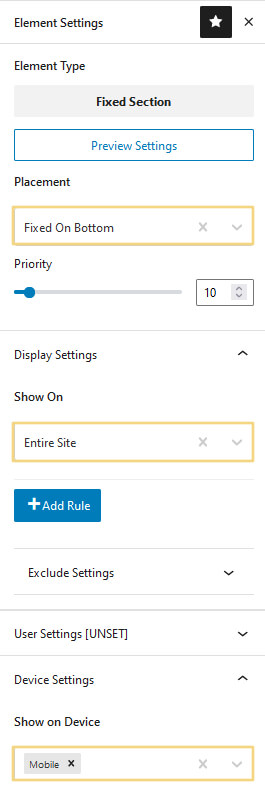
Save and publish your element and you’re done.
Add as a footer widget.
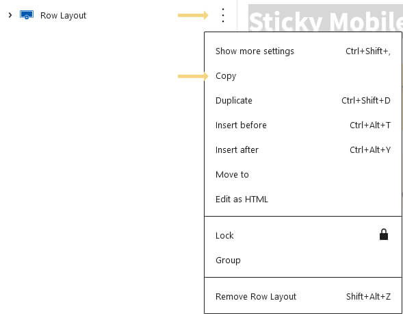
You can’t add blocks from the design library directly into widgets, so first create a new page or open an existing one, and load the Sticky Mobile Footer Menu 1 block from the Brand & Build blocks library. (You can delete the text block that directs you to this article.) Then click the 3 dots beside the row and hit ‘Copy’
Navigate to Appearance > Widgets. Open a spare widget area that has no other content and paste the block you just copied inside.
In the row settings for the menu block, click the visibility toggle and hide the row on desktop and tablet. (You can show on tablet if you want.)

Make any changes to the info boxes you wish, such as icons and text, and don’t forget to add your links to each info box.
The block comes with 5 menu items but you can duplicate the info boxes to create more, or delete ones you don’t need. The boxes will automatically grow and shrink to your content, so if you only have a couple of menu items, they will grow to fit the width of the screen.
Note: You have a limited amount of space. The block has been designed to fit down to around 375px with 5 items. If you need more items and find there isn’t enough space, try reducing the font and/or icon sizes, or adjust padding and margin. The info boxes will wrap to a new line when they run out of space, but this makes the block taller and will affect user experience.
Save your widget and navigate to Apperance > Customise > Footer.
Add your widget to one of the footer rows. It doesn’t really matter which but it’s best to add it to the bottom row.
Now navigate to Appearance > Customise > Additonal CSS and paste the following into that box:
#colophon .bb-sticky-footer-1 {
  position: fixed;
  left: 0;
  right: 0;
  bottom: 0;
  z-index: 9999;
}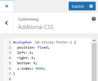
This will fix your new menu to the bottom of the screen on whichever devices you have it showing. Hit publish and you’re done. If you need to edit the menu, do that directly inside the widget.
We don’t know what we don’t know!
This KB article may seem a little sparse at the moment, but that’s because we don’t know what we don’t know!
If you have a question that isn’t answered, reach out to support and we’ll get back to you asap and add any relevant info here in the knowledgebase for other members.